
Two Methods to Building Histogram in Excel
Two Methods to Building Histogram in Excel: Building charts on Excel is a great way to show your data and create a visual impression. This is a better approach than showing tables that are full of numbers. And one of the most popular types of graphs is the histogram.
A histogram is a column chart. The column represents frequencies of each category or grouping. In advanced statistics, it is a representation of what is commonly called a bell curve, which shows whether the data spread is statistically closer to the 6-sigma level, skewed to the right, or skewed to the left.
But hey, you do not have to be a statistician to do this. All you need is an Excel spreadsheet, and we can show you how to make a histogram.
In this example, we will use a university. Let us say that you want to know how many students are within the age brackets of 16-18, 19-20, 21-22, 23-24, and 25-26.
METHOD 1: Doing it Manually
STEP 1
The first thing you need to do is to have your data set up. An example is shown below for 20 students with varying age. If there is no Histogram tool in your Excel version, you must do it the long way like what is shown below.
BIN means grouping or categories.
| Name | Age | BIN |
| Student 1 | 16 | 16 to 18 |
| Student 2 | 18 | 16 to 18 |
| Student 3 | 19 | 19 to 21 |
| Student 4 | 25 | 22 to 24 |
| Student 5 | 24 | 22 to 24 |
| Student 6 | 26 | 25 to 27 |
| Student 7 | 23 | 22 to 24 |
| Student 8 | 22 | 22 to 24 |
| Student 9 | 17 | 16 to 18 |
| Student 10 | 18 | 16 to 18 |
| Student 11 | 18 | 16 to 18 |
| Student 12 | 19 | 19 to 20 |
| Student 13 | 22 | 22 to 24 |
| Student 14 | 21 | 19 to 21 |
| Student 15 | 23 | 22 to 24 |
| Student 16 | 23 | 22 to 24 |
| Student 17 | 24 | 22 to 24 |
| Student 18 | 21 | 19 to 21 |
| Student 19 | 17 | 16 to 18 |
| Student 20 | 19 | 19 to 20 |
STEP 2
The next thing to do is to count the number of times each data point appeared. You can count this manually, or use the countif function to make it easier.
If you want it to be automatic, you can also use the pivot function to make your data appear like this one.
| Age Bracket | Count |
| 16 to 18 | 6 |
| 19 to 21 | 3 |
| 22 to 24 | 8 |
| 25 to 27 | 1 |
STEP 3
The next step is to highlight the data, click Insert, then click the Clustered Column.
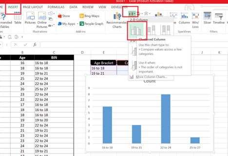
As you can see, now you have a histogram. The only thing left to do is to make adjustments on the aesthetics. You can change the name of the graph by clicking on it. You can also change the column color, remove the lines, add a gradient background, and so much more.
METHOD 2: Use the Instant Histogram Chart
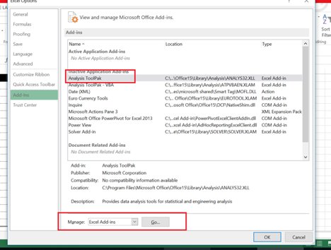
To be able to do this, you must have the Analysis Tool Pak in your Excel.
STEP 1
Click on File > Options > Add-Ins. You will get to this screen or dialog box.
STEP 2
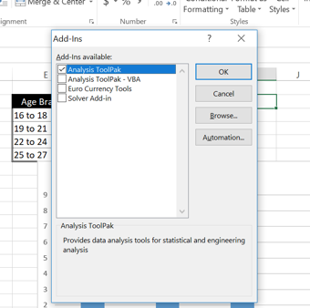
Click on Analysis Tool Pak then click OK.
STEP 3
Arrange your data and create a BIN range. This is the last digit in each of your age brackets.
| Name | Age | BIN | |
| Student 1 | 16 | 18 | |
| Student 2 | 18 | 21 | |
| Student 3 | 19 | 24 | |
| Student 4 | 25 | 27 | |
| Student 5 | 24 | ||
| Student 6 | 26 | ||
| Student 7 | 23 | ||
| Student 8 | 22 | ||
| Student 9 | 17 | ||
| Student 10 | 18 | ||
| Student 11 | 18 | ||
| Student 12 | 19 | ||
| Student 13 | 22 | ||
| Student 14 | 21 | ||
| Student 15 | 23 | ||
| Student 16 | 23 | ||
| Student 17 | 24 | ||
| Student 18 | 21 | ||
| Student 19 | 17 | ||
| Student 20 | 19 |
STEP 4
Click on Data > Analysis Tool Pak > Histogram > then OK.

STEP 5
Choose the Input range. This is the age. Next, choose the BIN; this is the grouping. Then click OK, and you will get the data below.

| Bin | Frequency |
| 18 | 6 |
| 21 | 5 |
| 24 | 7 |
| 27 | 2 |
| More | 0 |
STEP 6
The last thing to do is to create the same histogram in the same way we did it in Method 1.
Summary
Easy, right? Some Excel versions allow you to just highlight the entire data set, click Insert, click Histogram, and it will automatically create a histogram chart for you.
But if it doesn’t, now you know how to make one from scratch.
See our Blog page for other tutorials,
HOW’S YOUR DATA WORKING FOR YOU?
Have you ever wonder how to blow up your business’ productivity? You want a data expert that identifies your problems and make you look good!
If you’re still struggling to unlock all your data potential has to offer? Get in touch with us — we’d love to talk data with you.